“ATOOR”
Brand Redesign & Industrial Communication
Studio Gaph – September 2024
ATOOR is one of the pioneers in supplying refractory products for a wide range of industries. The company works with various sectors, including iron and steel, cement and lime, non-ferrous metals, petrochemicals, and refineries.
ATOOR offers a broad range of refractory products, from magnesia-carbon and alumina bricks to monolithic and precast refractories, ladle filling sands, fused cast blocks, and other specialized products—from raw materials to advanced, high-performance solutions.
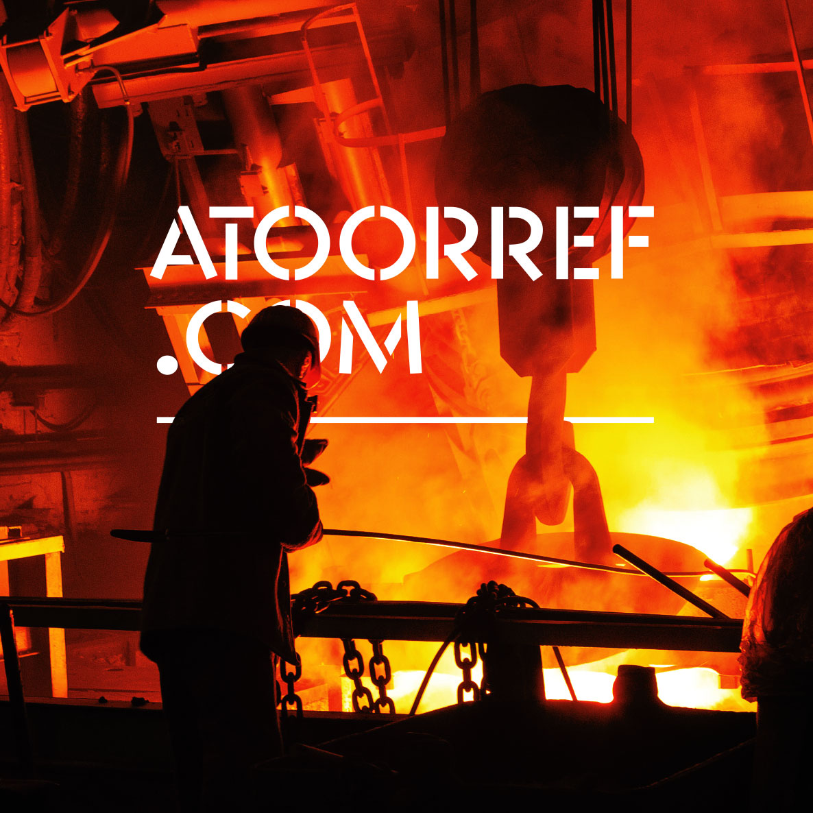
Over the past several years, we have maintained an ongoing collaboration with ATOOR across design, graphic design, and industrial photography. This collaboration has resulted in a diverse range of projects, including:
. ATOOR logo redesign
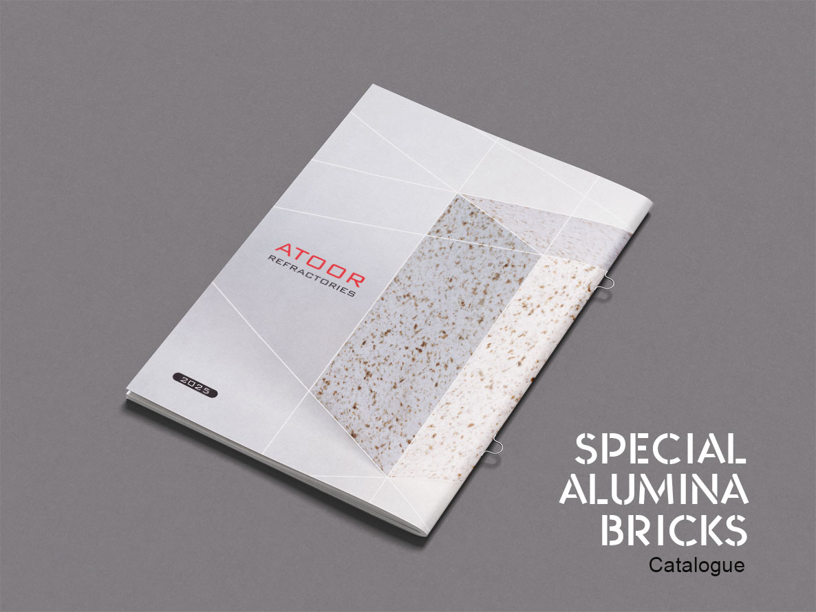
. Cement catalog design
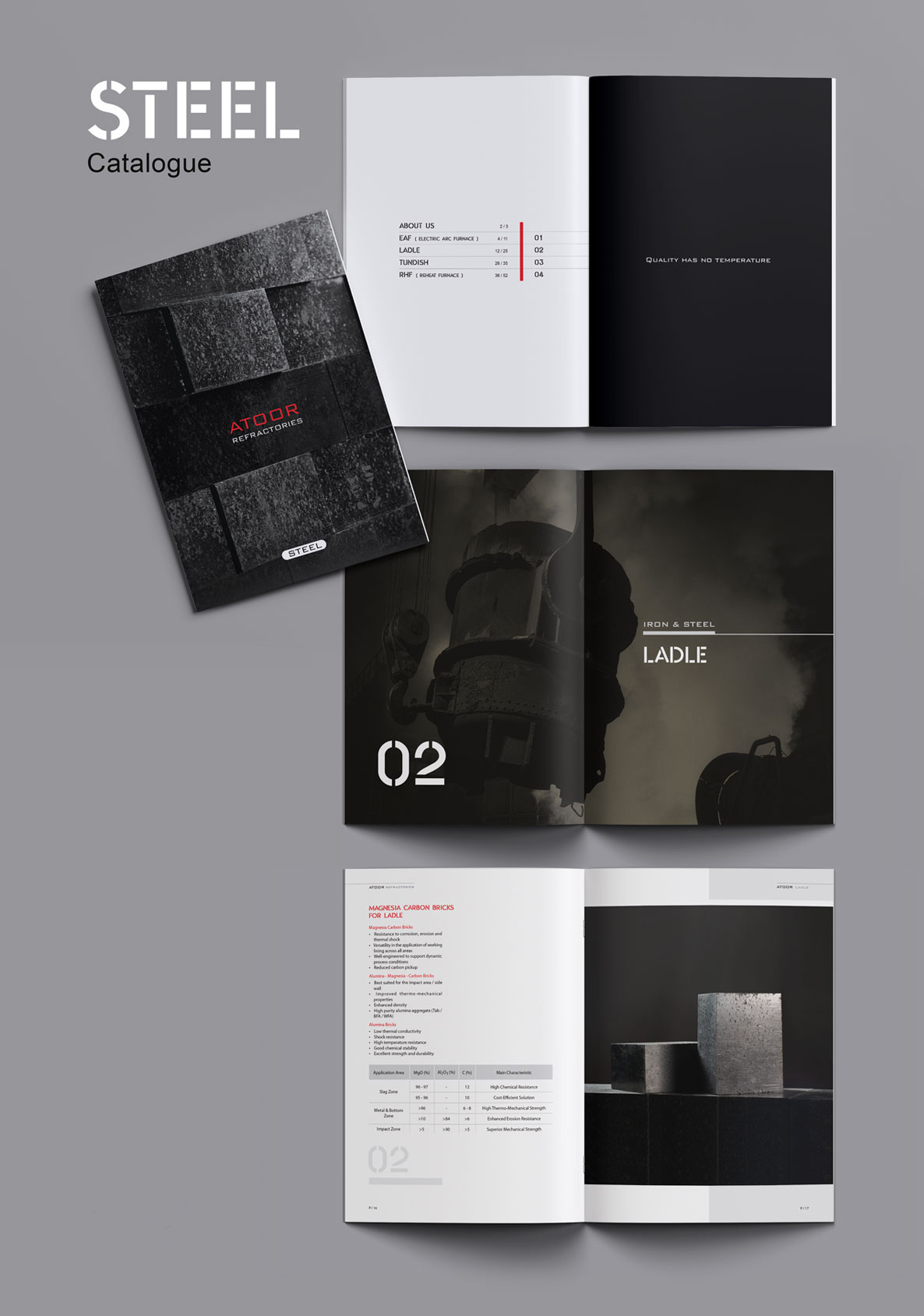
. Steel catalog design
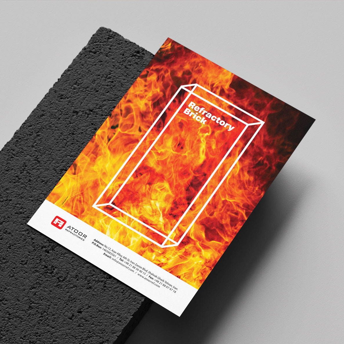
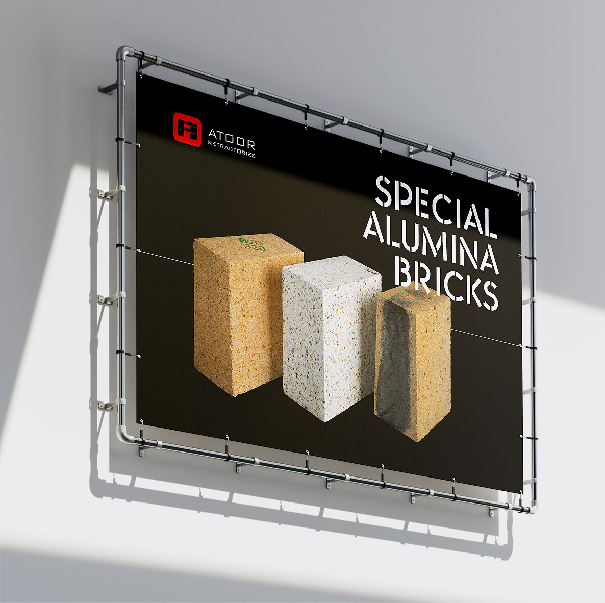
. Design of several advertisements for specialized industry magazines
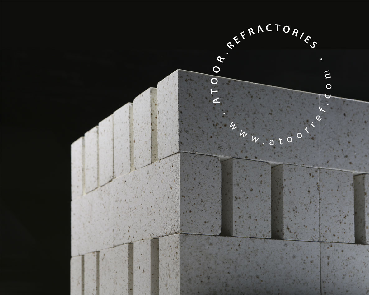
. Product photography
. Exhibition signage and display design
. And more
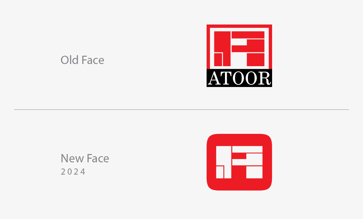
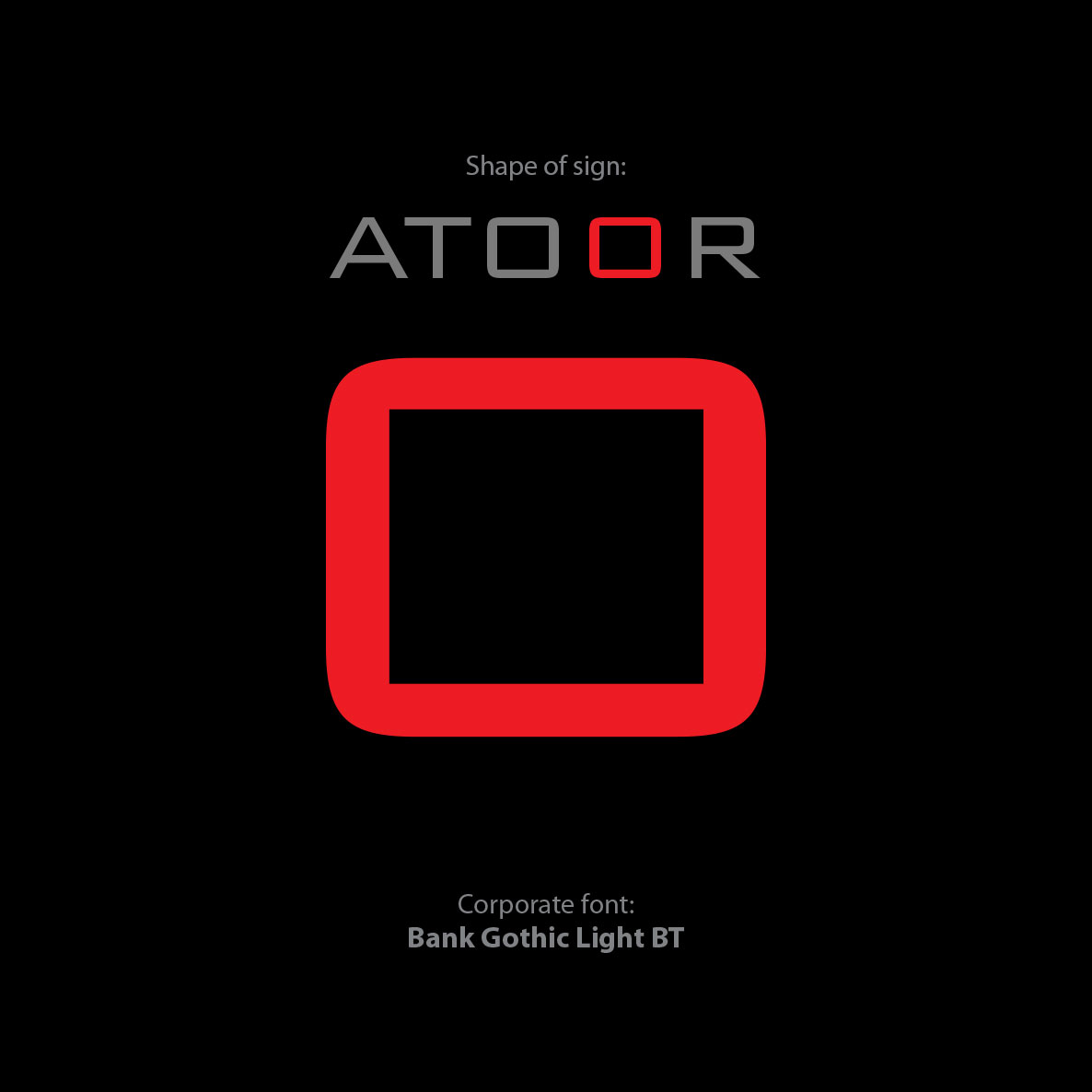
Logo Redesign, The logo redesign began with a relatively simple approach: selecting a new typeface as the brand’s corporate typeface and developing the letter “O” as the core visual element of the logo.
By simplifying the existing identity, we transformed the original square form into a softer shape with rounded corners. We also removed the English ATOOR wordmark that had previously been set in a serif typeface, replacing it with the newly selected typeface alongside the redesigned symbol.
The result was an updated identity that preserved the essential content and recognizable elements of the original logo while giving them a cleaner, more contemporary, and minimal expression.
Catalog Design, The next stage of the collaboration included the design of ATOOR’s cement and steel catalogs. Here, we took a minimalist approach, using large-scale, full-page product photography combined with carefully controlled and distinctive lighting.
The goal was to create industrial catalogs that could also have a strong visual and somewhat artistic character. This was, in itself, an interesting challenge: industrial products such as refractory bricks do not naturally offer the most visually engaging subjects for full-page imagery. Through composition, scale, lighting, and photography, we sought to give these functional products a more compelling visual presence.
Advertising & Visual Communication, For the advertising campaigns, we explored a variety of visual directions and formats, experimenting with different approaches until we arrived at solutions that met the client’s expectations and communication needs.
Overall, working with ATOOR introduced us to a new visual challenge within an industry that was relatively unfamiliar to us. Translating a highly technical and industrial subject into a coherent and visually engaging design language was a rewarding process—and one we genuinely enjoyed.